TERRAWATCH SPACE BRAND IDENTITY
For TerraWatch Space
Created with Adobe Illustrator
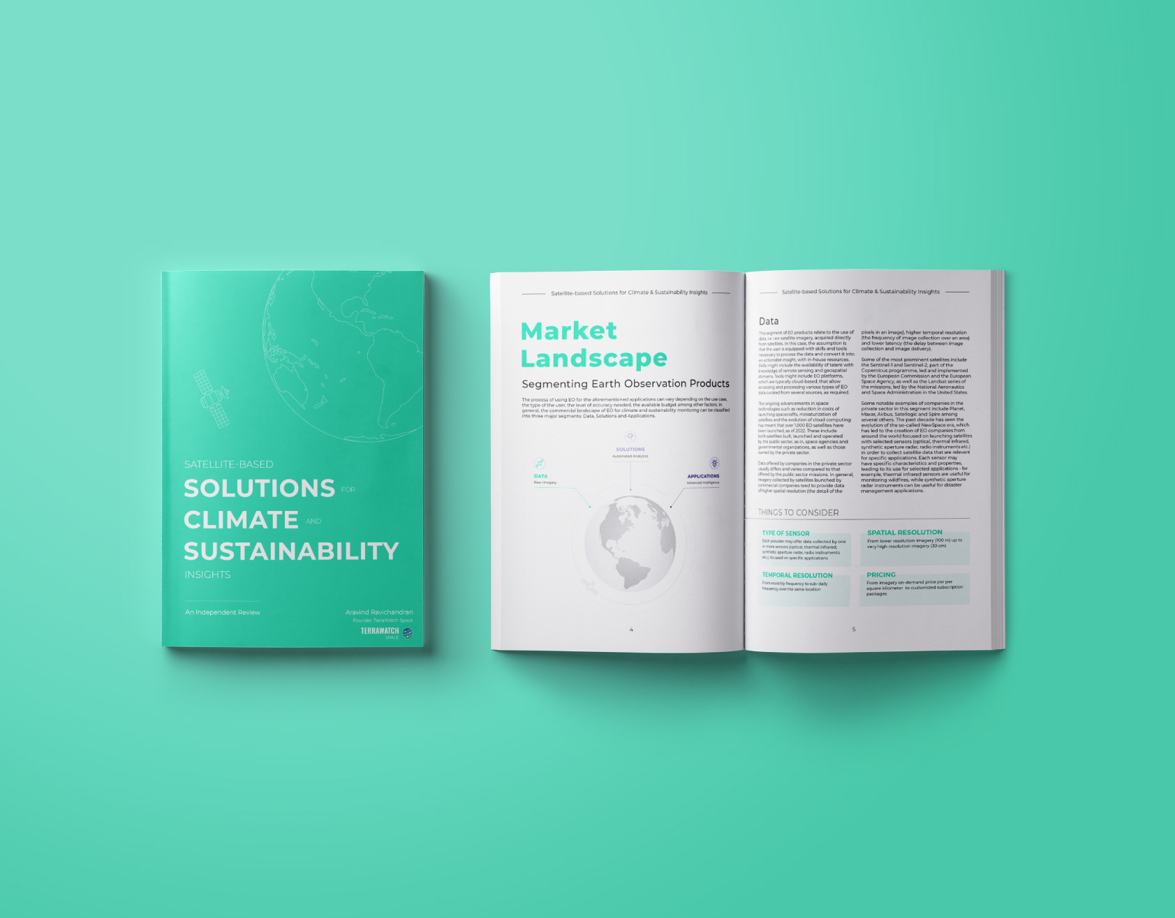
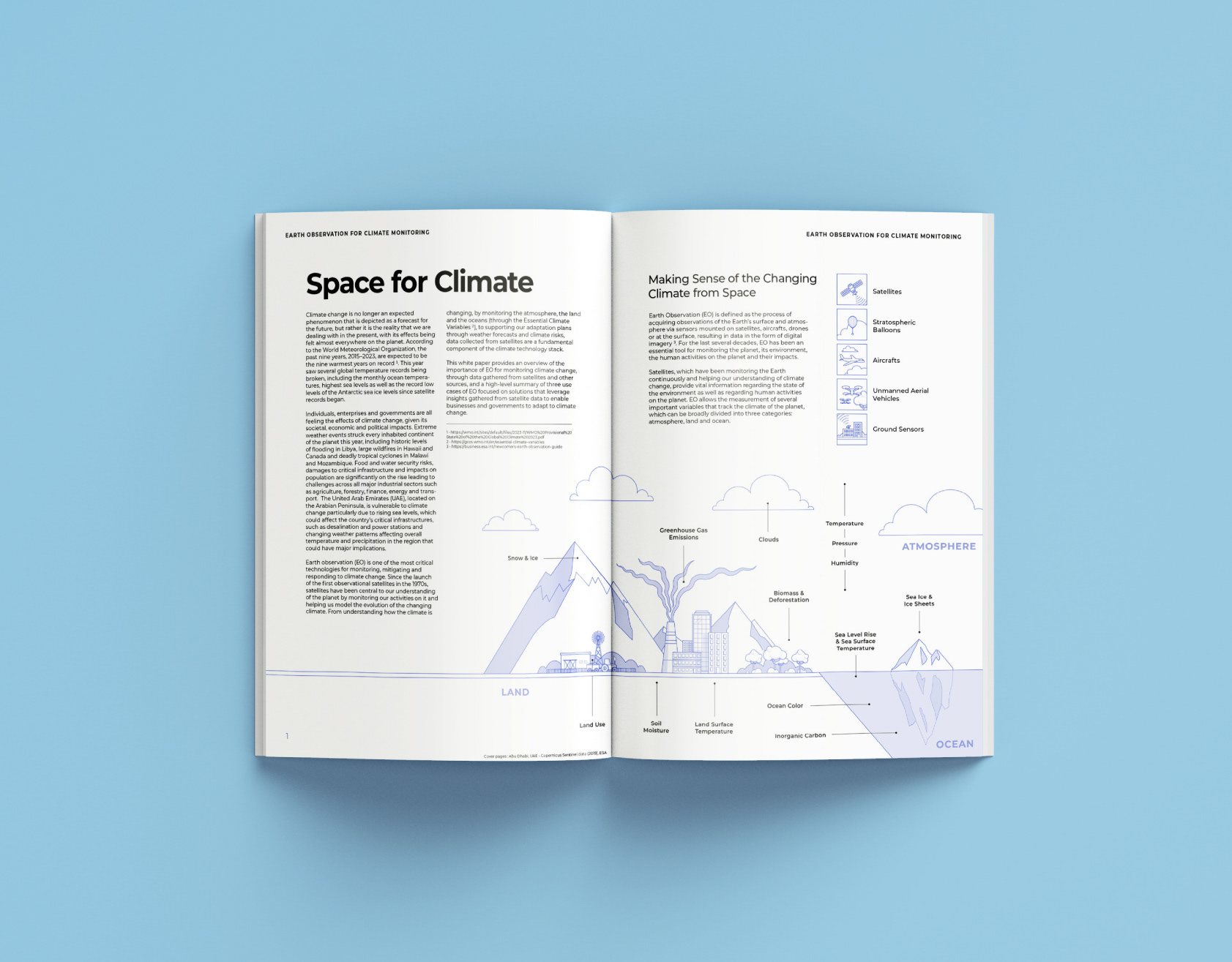
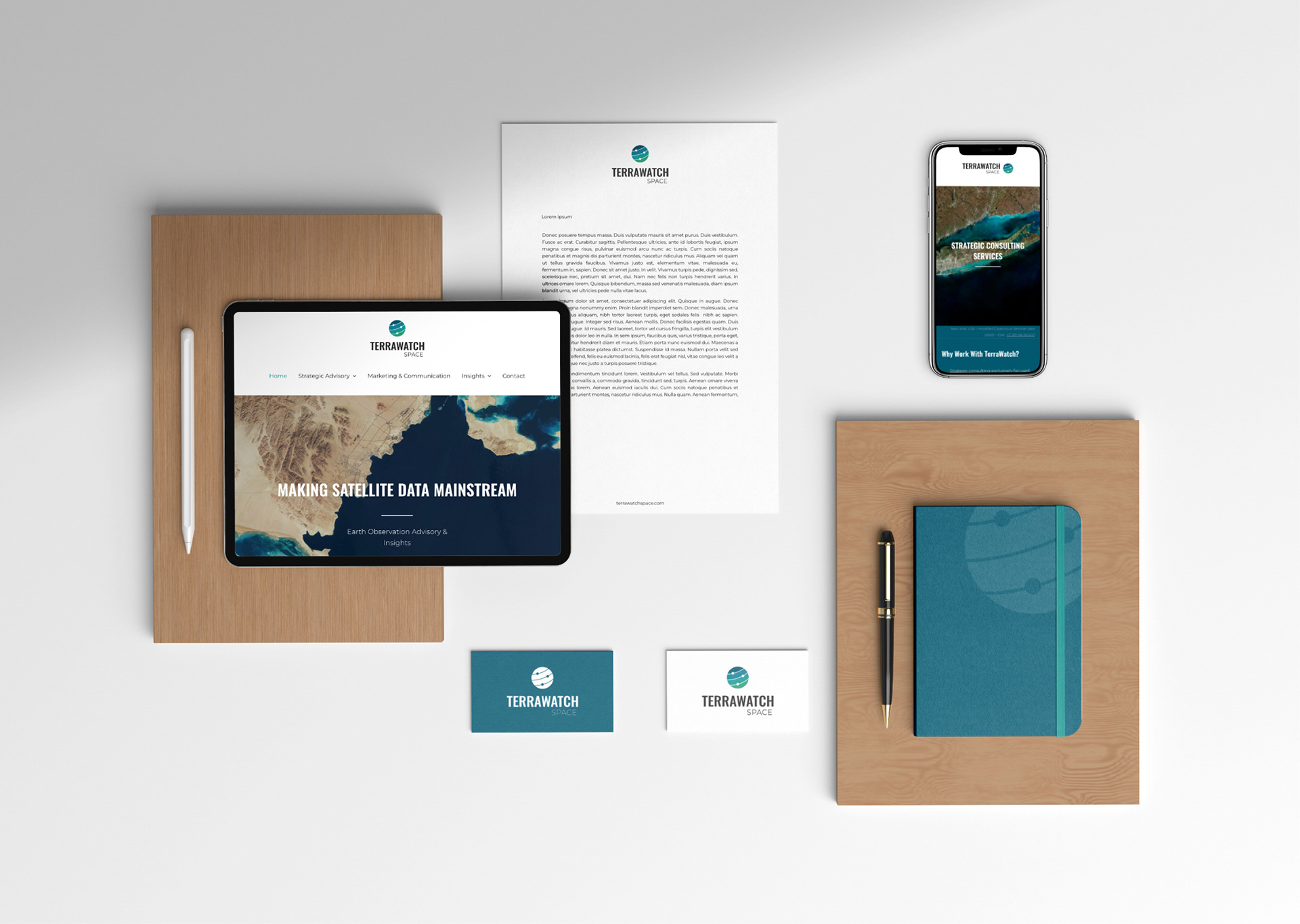
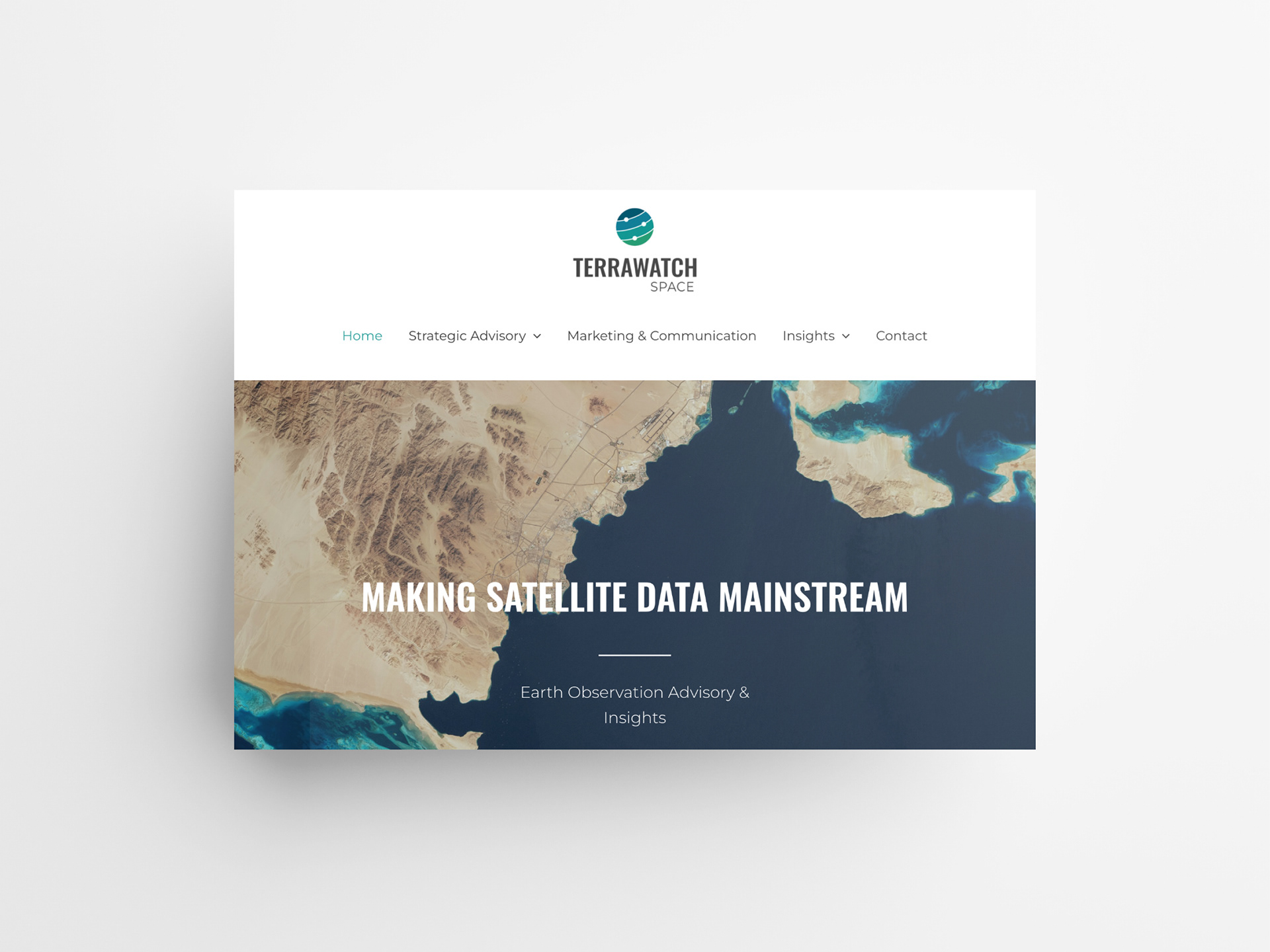
TerraWatch Space is a strategy and communication consultancy focused on Earth Observation (EO) satellites. Aravind Ravichandran, its founder, provides strategic advisory and marketing services to companies and organisations, both in and out of the space industry, and publishes a newsletter that serves its readers with the latest news and insights into the EO industry.
I have worked with TerraWatch for a while and came in for a complete brand refresh at the end of 2022.
Satellite image: Tashkent, Uzbekistan – modified Copernicus Sentinel data (2023) – ESA, CC BY-SA 3.0 IGO
Logo Design & Brand Colours
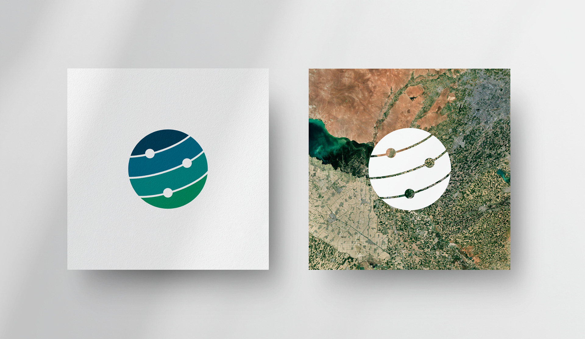
The new TerraWatch logo is inspired by Earth and orbiting satellites. TerraWatch may operate in the space industry but it focuses on Earth and, specifically, what satellite data can do for us. This point was also the main driver for selecting the brand colours. From deep-sea blue to forest green, they naturally evoke planet Earth.
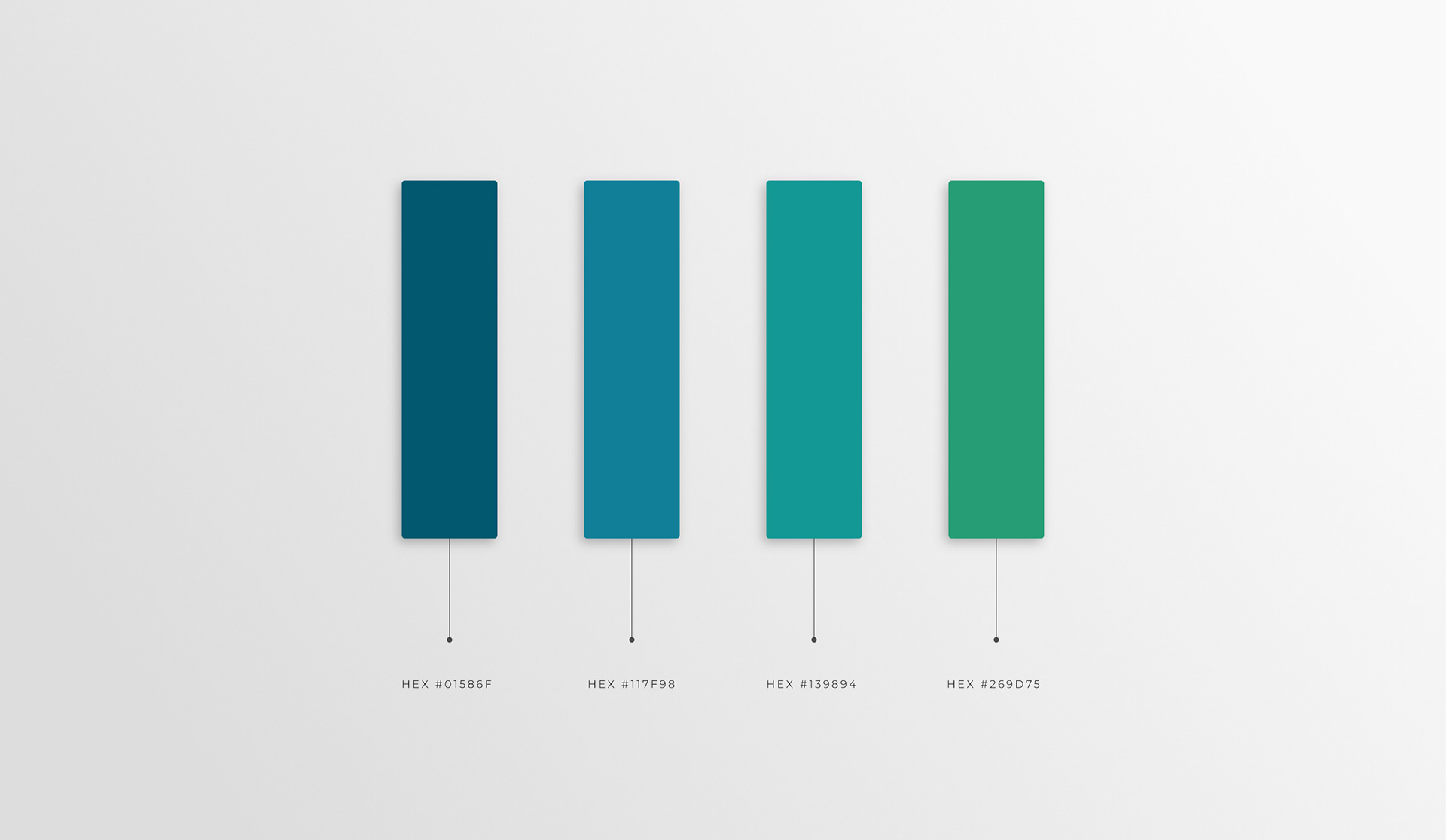
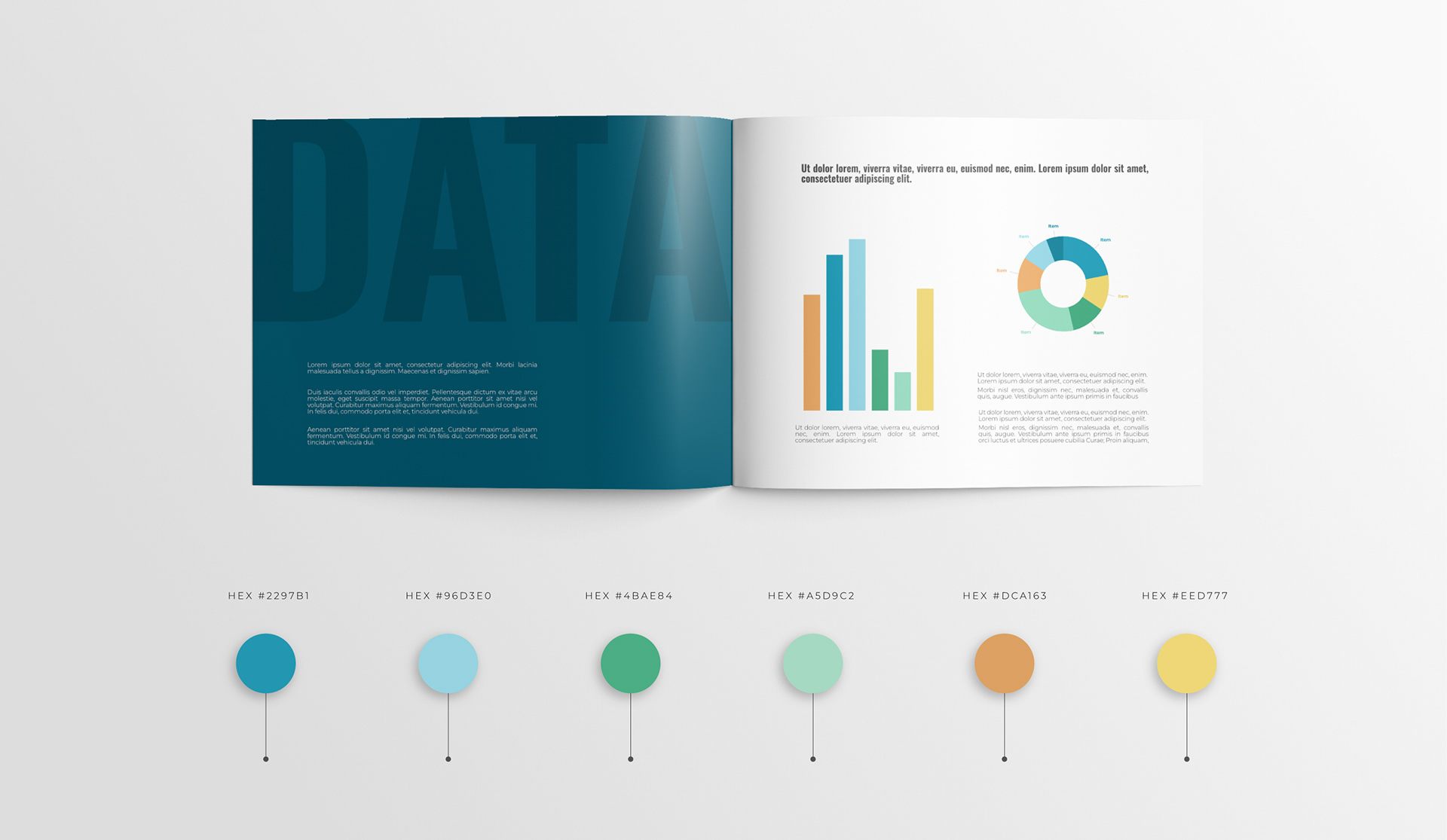
Extended Colour Palette
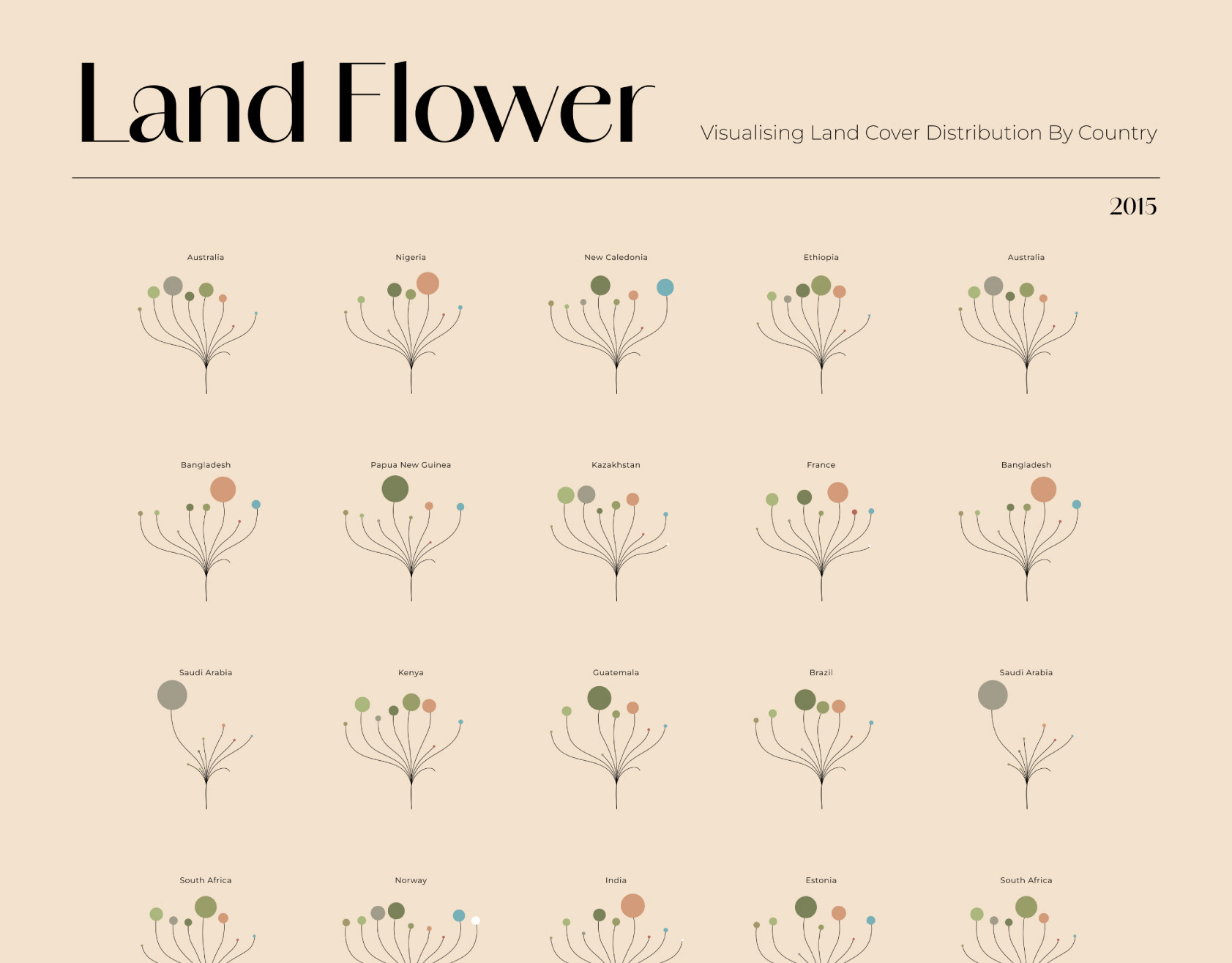
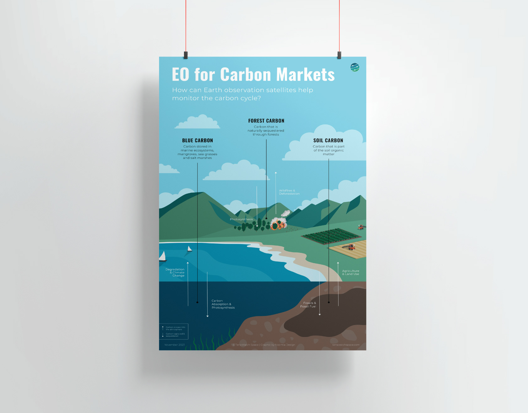
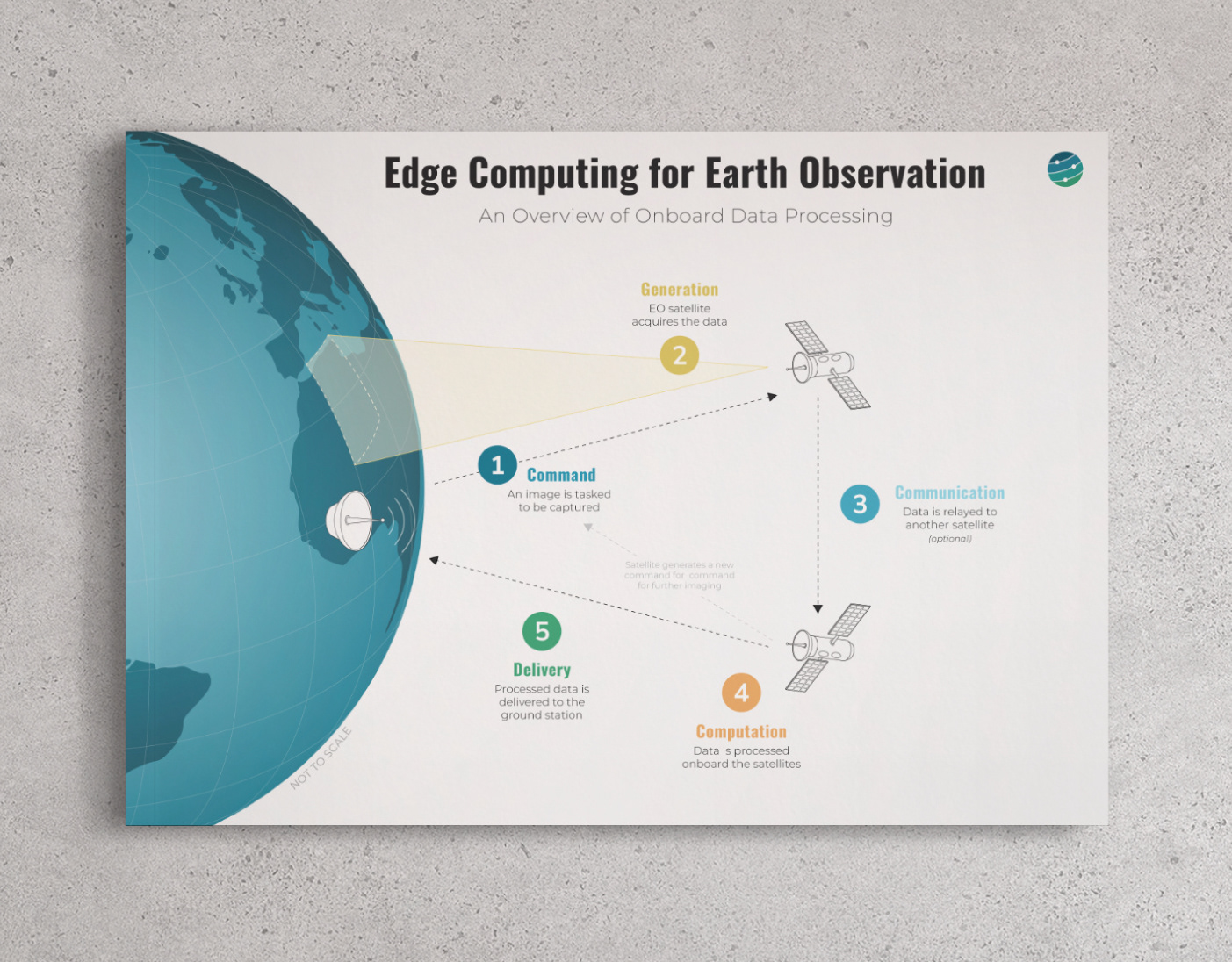
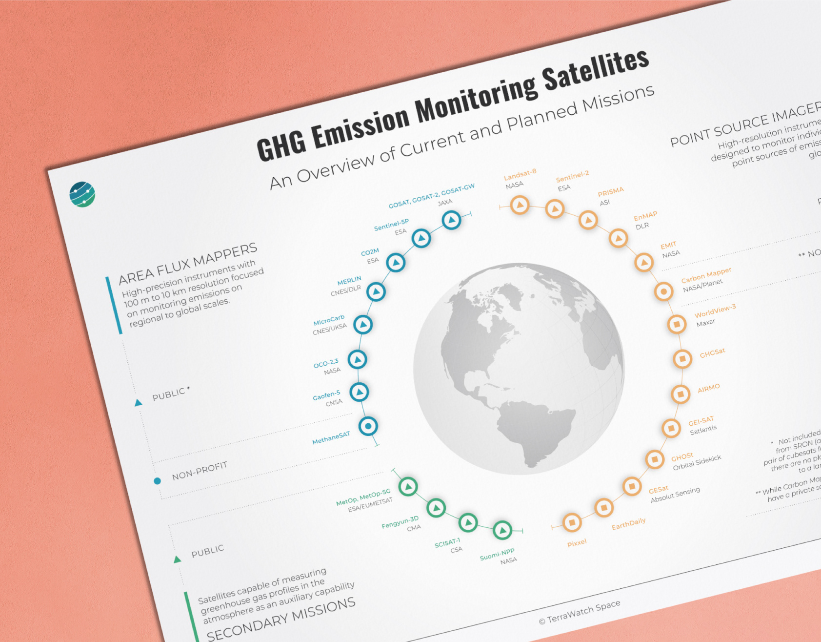
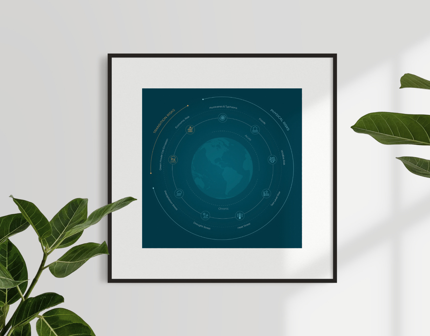
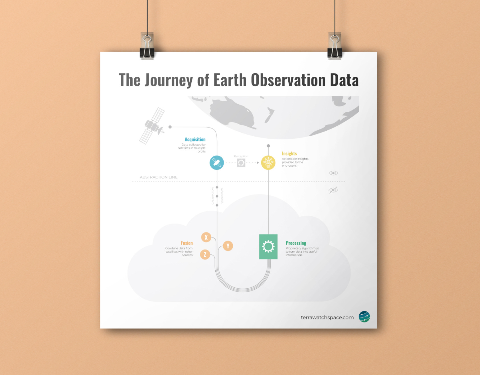
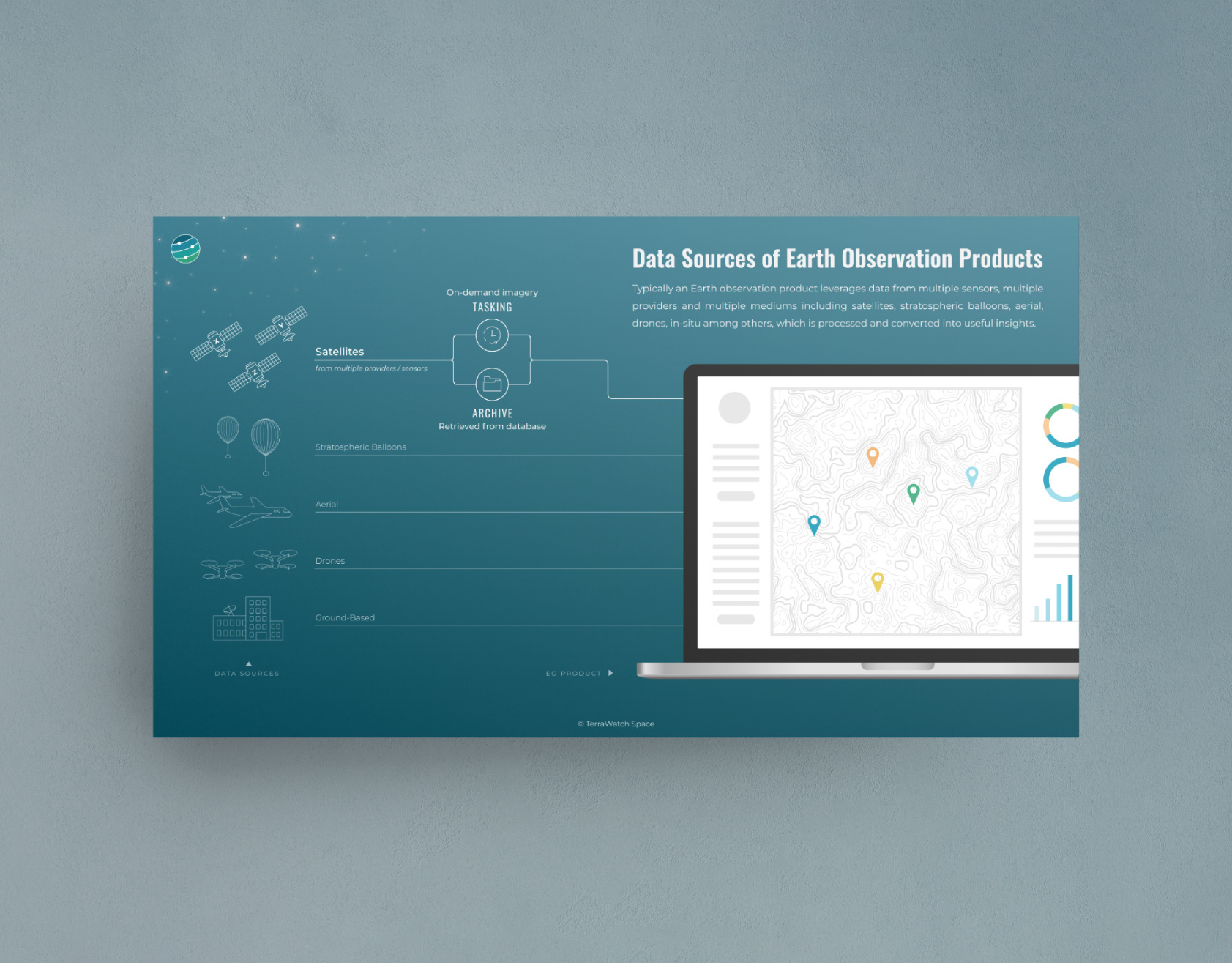
TerraWatch Space makes a point to demystify the Earth Observation industry for its audience. This means a lot of the data and complex concepts are translated into infographics and data visualisations. I created a specific colour palette that branches out from the main brand colour scheme while still remaining recognisable as part of the TerraWatch brand.
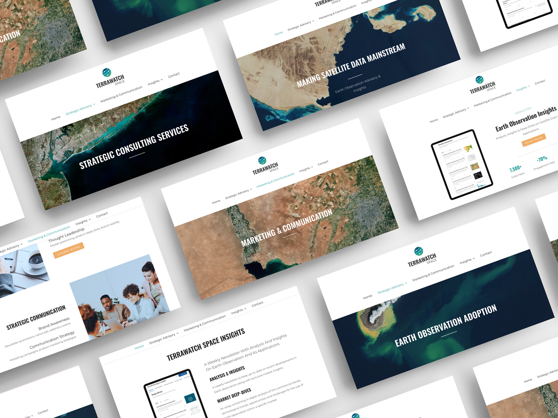
Satellite images: modified Copernicus Sentinel data – ESA, CC BY-SA 3.0 IGO